Slider Control
The Slider control allows mobile users to submit an answer by selecting a position along a slider. This is useful for capturing numeric responses such as goal and sub-goal progress. You can configure the slider with minimum and maximum values, step intervals, and optional labels.
The Slider control is only available for Android devices.
Configuring the Slider Control
-
In WebAdmin, select Forms.
-
Select an existing form, or select Add New Form to create a new one.
-
Navigate to an existing element within your form or select Insert a new Element
 .
. -
Select Maintain Element Settings
 .
. -
In the Update Element Details window, select the Slider control.
-
Configure the control as follows:
-
Select the Text field, and enter a description for the new control.
-
To map a folio to the control:
-
Select Edit Folios
 .
. -
In the Folios dialog, select Folio, Element or URL from the dropdown, then add the appropriate content and select Add
 .
. -
Select OK.
-
-
To add a contextual Image for the control, select Select Image
. For more details refer to Image Context for Form Controls. -
To promote the element when the form has a status of In Progress, Complete or Submitted, toggle Promoted to On, then enter a suitable prompt in the Promoted Prompt field. Promoting means that when you return to the details screen of the visit, the value of the promoted field displays under the form task.
-
To hide the element from mobile users, toggle Hidden to On.
-
To make the element read only, select the Read-only field and select an option from the dropdown.
-
Select the Minimum* field, and enter the value to display on the lower (left) end of the slider. The default is 0.
-
Select the Maximum* field, and enter the value to display on the upper (right) end of the slider. The default is 10.
-
Select the Default Value* field, and enter the slider value that is selected by default on the form. This must be between the minimum and maximum value, and match the selected Step Size - for example, if the step size is set to 2 on a slider that goes from 0 to 10, you cannot set a default value of 5.
All slider values must be integers. You can use negative values - for example, configuring a slider that goes from -5 to 5.
-
Select the Minimum Label field and enter a label to display at the lower end of the slider.
-
Select the Maximum Label field and enter a label to display at the upper end of the slider.
-
Select the Step Size* field, and enter a number to define the steps on the slider. The default is 1.
For example, if the slider has a Minimum of 0, and a Maximum of 10, a step size of 1 creates a slider with notches at 1,2,3 and so on. Setting the step size to 2 creates a slider with notches at 2, 4, 6 and 8.
-
Optionally, to add labels for steps on the slider:
-
Select the Step Value field and enter the step where the label will appear. This must match the selected Step Size - for example, if step size is set to 5 on a slider that goes from 0 to 10, you can only enter 5. In this example the label will appear at the central point of the slider.
-
Select the Label field and enter the label text.
-
Select Add
 .
.
-
-
Select Save.
* Required field.
-
-
Save
 and Publish
  the form.
 -
Ensure the form is assigned to an application or a visit task within a solution.
 Using the Slider Control on Android
-
On the Android device, navigate to the Form.
If it is editable and has not been previously amended, the slider control within the form appears with the default value set.
-
Tap the slider to edit it.
The slider control appears in a popup.
-
Touch and drag the slider bar to the required value. When released, the slider snaps to the nearest valid value. For example, if the slider goes from 0 to 10 and the step size is 2, you can only set the slider value to even numbers.
If you have configured labels for steps on the slider, those labels appear when you move the slider bar over the step.
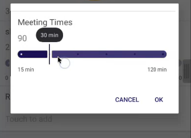
-
Select OK.
-
Submit the form.