Widgets
Widgets can be shown on each of the Home page tabs, and are there to provide an overview of your assets.
Widget Configuration
-
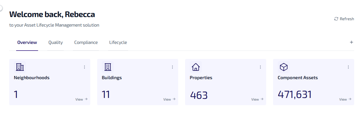
The Home page supports 4 widgets per row.
-
Widgets are positioned in a grid layout. A new row starts automatically after every 4 widgets.
-
Administrators can create and modify widgets, and choose whether these are shared with other users. Only widgets which are shared are visible to other user types.
Widget Types
These are the different types of widget available:
Each type of widget works and behaves in a different way.
Information Widget
The Information widget shows data in an informational format, such as the number of assets of a particular type e.g. 17 Neighbourhoods.

When configuring an information widget:
-
You must set a filter to specify what data is shown.
-
You can optionally select an icon to appear on the widget.
The information widget behaves in the following way:
-
The widget links to the Asset Register. Select View on the widget to be redirected to the Portfolio > Asset Register with a filtered asset list matching the filter applied to the widget.
-
The widget does not change colour.
Percentage Widget
These show data in a percentage format, such as the percentage of assets of a certain type e.g. 88% Decency.

The widgets can be configured to change colour based on predefined percentage thresholds, allowing for quick identification of performance levels or status changes.
When configuring a percentage widget:
-
You must set a filter to specify what data is shown.
-
You can configure the colour changes based on predefined percentage thresholds by selecting a custom colour via the colour picker. By default, the widget follows the Red, Amber, Green, and Blue (RAGB) colour scheme. The threshold colour settings defaults are:
-
If percentage up to X → default: Red
-
If percentage up to Y → default: Amber
-
If percentage up to Z → default: Green
-
If percentage up to W → default: Blue
-
The percentage widget behaves in the following way:
-
The widget links to the Asset Register. Select View on the widget to be redirected to the Portfolio > Asset Register with a filtered asset list matching the filter applied to the widget.
-
The left side of the widget dynamically changes colour based on the percentage values and user defined settings.
Conditional Widget
These show informational data with an additional colour change feature based on predefined conditions e.g. 3 Non-Decent Properties displaying an amber colour threshold.

Threshold values can be configured to determine when the widgets colour changes, allowing for quick identification of the status or level of a specific metric.
When configuring a conditional widget:
-
You must set a filter to specify what data is shown.
-
You can configure the colour changes based on predefined threshold values by selecting a custom colour via the colour picker. By default, the widget follows the Red, Amber, Green, and Blue (RAGB) colour scheme. The threshold colour settings defaults are:
-
If value up to X → default: Red
-
If value up to Y → default: Amber
-
If value up to Z → default: Green
-
If value up to W → default: Blue
-
The conditional widget behaves in the following way:
-
The widget links to the Asset Register. Select View on the widget to be redirected to the Portfolio > Asset Register with a filtered asset list matching the filter applied to the widget.
-
The left side of the widget dynamically changes colour when the defined threshold value is met.
Preview Widget
These display data in an informational format, such as the number of assets of a particular type e.g. 3 assets Under Maintenance.

When configuring a preview widget:
-
You must set a filter to specify what data is shown.
-
You can configure the colour of the bar at the top of the widget using a colour picker.
The preview widget behaves in the following way:
-
The widget links to the Asset Register. Select View on the widget to be redirected to the Portfolio > Asset Register with a filtered asset list matching the filter applied to the widget.
-
The widget does not change colour.